Why most screenshots underperform before a user reads a word
App Store search results show a narrow crop of your first screenshot alongside your icon and app name. A user decides whether to tap through in roughly two seconds, based almost entirely on what they can see in that crop — which is roughly the top 40% of your first screenshot.
If your caption is in the bottom half of the image, it's invisible in search. If your background matches the App Store's white card, your screenshot disappears into the page. If your type is small or low-contrast, it's unreadable at thumbnail size. These are visual decisions — independent of what your caption actually says — and they determine whether your listing gets a tap before any copy is read.
The good news: fixing visual layout is faster than writing better copy. And the patterns in high-converting screenshots are consistent enough that there's a reliable template to follow.
Element 1: Caption placement in the top third
The most important layout decision in your first screenshot. App Store search results crop to approximately the top 40% of your screenshot image. Any text or visual element below that line is invisible to users who haven't tapped through yet.
Browse the App Store in any category and look at the search results. The listings with captions you can actually read in the search view — without tapping — all share the same placement: headline text in the top 25–40% of the image, above or overlapping the top of the device frame if one is present.
The caption placement rule: the last line of your headline text should be above the midpoint of the image. If you're using a device frame, the caption sits above the phone — in the background space between the top of the image and the top of the device. If you're going frameless, it sits directly over the top of the UI.
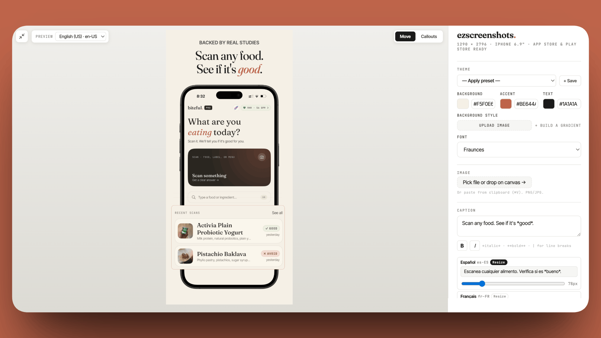
You can verify your exact crop before exporting using the search result preview method described in our post on previewing App Store search results. ezscreenshots places captions in the top third by default — the editor shows the full canvas at export dimensions so you can see exactly what will be cropped.
Element 2: Background contrast against the App Store card
The App Store's search result cards have a white background on a light grey page. A screenshot with a white background — whether the app's UI is white or you've set a white canvas background — blends into the card and loses visual definition. The listing effectively disappears.
High-converting screenshots almost universally use one of three background approaches:
- Solid color: a single brand color that contrasts with white. Dark navy, deep purple, forest green, rich teal. Anything that creates a clear edge between your screenshot and the App Store card.
- Gradient: two colors that transition across the background — often the brand's primary color to a slightly lighter or darker variant. Gradients add depth without requiring a designer to create them.
- Dark mode: for apps with a dark UI, a near-black background creates natural contrast and often reads as more premium than a light variant.
One practical constraint: avoid gradients that end on transparent or pure white — they fade into the card edge and lose contrast exactly where you need it most. Any gradient should end on a fully opaque, non-white color.
In ezscreenshots, the background color picker and gradient controls are in the right panel. The editor auto-detects a dominant color from your screenshot on first drop and suggests a complementary background — you can keep it or adjust. For gradient backgrounds, the two-stop gradient tool lets you set start and end colors with a live preview at export dimensions.
Element 3: Caption copy — outcomes, not features
The visual template is only as good as the words in it. A perfectly placed, high-contrast caption that says "Habit Tracker" converts worse than a slightly off-placement caption that says "Build a streak that actually sticks."
The pattern in high-converting captions is consistent: they describe what changes for the user, not what the app does. Feature language ("Track your habits") describes the mechanism. Outcome language ("Build a habit in 21 days") describes the result the user is buying.
A quick test: read your caption and ask "does this describe the product, or does this describe what happens to me if I use it?" If it describes the product, rewrite it as the latter. This single change — feature to outcome — is the most commonly cited improvement after a PPO test, across every app category.
Caption length matters too. The crop zone fits roughly 5–8 words comfortably at a readable size. Longer captions either require smaller type (which becomes unreadable at thumbnail size) or get cut off. Aim for under 6 words for the headline, with an optional shorter subheadline below it if space allows.
Element 4: Font choice and weight
App Store screenshots aren't read — they're scanned. The type needs to communicate at a glance, not on close inspection. This has two practical implications: use heavy weights (Bold or Black), and avoid decorative fonts that sacrifice legibility for personality.
The fonts that work consistently well in App Store screenshots share three properties: they're sans-serif or softly geometric, they have a high x-height (which improves readability at small sizes), and they have a Bold or Black weight that holds at thumbnail scale. Inter, Poppins, DM Sans, and Outfit are common choices. Thin or Light weights disappear against a colored background at small sizes.
Avoid script fonts for your headline entirely — they're illegible at thumbnail size regardless of how good they look at full size. If your brand uses a script font, it belongs on your icon, not your screenshot caption.
ezscreenshots includes eight curated display fonts selected specifically for App Store screenshot legibility — each has been tested to hold at the search result crop size. You can also upload your own brand font if you have one.
Element 5: Device frame alignment and scale
When using a device frame, the size and position of the phone relative to the canvas affects how much screen content is visible and how much background shows around it. Two common mistakes:
Frame too large: the phone fills the entire canvas, leaving no background visible for the caption. The caption gets pushed onto the screen UI, where it competes with the app content. The background color does no work because there's nothing to see it on.
Frame too small: the phone appears as a tiny element in a sea of background. The UI content becomes illegible at thumbnail size, and the screenshot reads as an abstract design asset rather than a real product.
The right proportion: the device frame should occupy roughly 55–70% of the canvas height, leaving enough background at the top for the caption and at the bottom for visual breathing room. The phone should be vertically centered or slightly below center — captions read more naturally when they're above the phone rather than below it.
For screenshots 2–5 on the product page (seen after a tap-through, at full size), you have more layout flexibility. The search result crop constraint applies only to screenshot 1. For subsequent screenshots, two-column layouts (two phone screens side by side), callout annotations, or wider margin designs all work well — they just shouldn't be used on the first screenshot where the crop is the dominant constraint.
Element 6: Visual consistency across the set
A screenshot set where each screenshot uses a different background color, font, or layout style reads as unfinished — like a deck assembled from different decks. Consistency signals polish and attention to detail, which transfers (subconsciously) to the user's perception of the app itself.
The minimum consistency requirements across a screenshot set:
- Same background color or gradient family across all screenshots
- Same font for all captions
- Same device frame style (or consistently no frame)
- Same caption placement zone (all top third, or all at a specific consistent position)
The content of each screenshot changes; the design system stays the same. This is the pattern that makes a set look professionally designed even when it was built in 20 minutes with a browser tool.
In ezscreenshots, the multi-screen feature keeps all your screens on the same theme — background, font, accent color, and frame settings persist across all screens in a project. You switch between screens to drop in different Simulator screenshots, and the design system applies to each. Exporting the full set exports every screen at the correct device dimensions.
The complete template in one place
Applying all six elements to your first screenshot:
- Background: solid brand color or gradient — not white, not transparent. Ends on an opaque, non-white color.
- Caption position: headline text entirely within the top 40% of the image. Last line above the midpoint.
- Caption copy: outcome language, 5–6 words maximum. "Build a habit in 21 days" not "Habit Tracker."
- Font: Bold or Black weight, sans-serif, high x-height. Readable at arm's length on a phone.
- Device frame: 55–70% of canvas height, slightly below center vertically, caption above the phone.
- Consistency: same background, font, and frame style across screenshots 1–5.
Before submitting, preview how screenshot 1 looks in a search result crop — the search result preview guide explains how. If the caption is readable and the background creates clear visual separation at that size, the template is working.
For the dimension requirements for each device size — Apple requires specific pixel dimensions per device class — see the complete App Store screenshot sizes guide.
Apply the template to your screenshot in 10 minutes
Drop your Simulator screenshot into ezscreenshots, set a brand-color background, write the outcome caption, position it in the top third, toggle the device frame. Export at the right dimensions for every device size. Free, no account needed.
Try ezscreenshots →Summary
- Caption in the top 40%: the search result crop shows only the top portion of screenshot 1 — any caption below that line is invisible before a tap
- Non-white background: white-on-white disappears into the App Store card; use a solid brand color or gradient that ends on an opaque non-white color
- Outcome language: "Build a habit in 21 days" converts better than "Habit Tracker" — describe what changes for the user, not what the app does
- Bold weight, short headline: 5–6 words max; Bold or Black weight; sans-serif with high x-height; readable at arm's length on a phone screen
- Device frame at 55–70% canvas height: enough background visible for the caption above, enough breathing room below
- Consistent design system across the set: same background family, font, and frame style for all 5 screenshots — consistency signals polish
- Preview before submitting: verify caption is readable in the search result crop before export